The 12 Best Huddersfield Town Shirts Ranked

Brady Frost, Feature Writer
Twitter: @brady0894
Source for image above: HTAFC
With Huddersfield Town’s new shirts for the season released, we made Phil Delves, Head of Content at Football Shirt Collective, rank 12 of Town’s best football shirts over the years.
What’s your favourite Huddersfield Town shirt? The first one you got as a kid? The one you remember as The Terriers clinched a promotion, or is your favourite shirt associated with a past iconic player?
Everyone has an opinion when it comes to football shirts. Decades ago, most fans would only see their team’s new shirt when the season began. Now, social media has brought more fanfare to kit launches, with clubs across the world coming up with innovative ways to showcase their new shirts. Whether it’s being launched into space or planting flowers to reveal your new kit, nothing is off the table for announcing new season shirts. Huddersfield are no strangers to bizarre kit launches either, with last season’s famous Paddy Power stash stunt resulting in a £50,000 fine from The FA for breaching advertising rules.
Now that Huddersfield have announced their new shirts for the season, we wanted to take a look at some of the most iconic kits Town have had over the years and pick the best. So we spoke to a football shirt expert, Phil Delves, Freelance Content Creator and Head of Content at Football Shirt Collective, to rank some of Huddersfield Town’s most famous shirts.
From the red ‘Electric Hoops’ kit in the early 90s to all three of the shirts this season, there’s so many shirts to choose from, so we had to narrow down, which means some of your favourites might not feature. Scroll down below to see the list and Phil’s reasoning.
12. 1987/89 Home Shirt
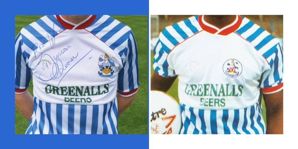
For a lot of supporters, it brings back happy memories as striker Craig Maskell scored 33 goals wearing this shirt in the 1988/89 season. Photo sources: Examiner, English Football Retro TV
With the Greenalls Beers sponsor and red collar and cuffs, this home shirt is memorable for a lot of Town fans. For a lot of supporters, it brings back happy memories as striker Craig Maskell scored 33 goals wearing this shirt in the 1988/89 season. Despite this, from a style perspective, Phil ranked it last. He said:
“When I’m looking at this objectively, I don’t think it’s an aesthically pleasing shirt. What I will say is that it’s very memorable and from a design perspective, one of the most unique, if not the most unique on this list. It actually reminds me of a lot of shirts we’ve seen in recent years, like New Balance and Adidas who have different templates that lock off the top section of the shirt, like it does with the stripes. When I look at that, I wouldn’t want to own that shirt from an aesthetic point of view but to be honest, to put it at 12 in this list shows that this list is pretty strong and by no means is it a bad kit.”
11. 1991 Third Shirt

The third shirt worn in the 1991/92 season comes in at number 11 on our list. At the time of writing, you can pick this shirt up on eBay for the very modest price of £749.99. Bargain. Despite the hefty price tag, Phil thinks it’s too safe to be a real classic.
“It’s a timeless design, it’s the kind of kit you could wear now but it doesn’t stand out for me enough to be any higher on the list. I think Gola was a great sponsor and we’re going to see that sponsor again much higher up the list, but it’s the colour on this shirt too. Despite it being an interesting colour, very muted navy, almost grey, I don’t think it does enough. It’s a very safe kit and I wouldn’t pick it out of a crowd despite the good sponsor and its timeless nature.”
10. 2020/21 Away Shirt

According to the club, the overall red on the front is described as ‘Chili Pepper Red’ while the brighter collar and cuffs are “Lollipop Red’. Photo source: Twitter
We reach the first kit of this season on the list. Coming in at number ten, it’s the new red away shirt. According to the club, the overall red on the front is described as ‘Chili Pepper Red’ while the brighter collar and cuffs are “Lollipop Red’. Tasty. Here’s why it’s not whetting Phil’s appetite.
“Of all the new kits, this one suffers the most from the lack of a sponsor. From a design perspective, I’m not particularly keen on the construction of it. You’ve got the blocked off section at the top and I’m not overly keen when shirts do that as it looks a little bit clunky. There’s a bit of a texture going through this shirt, but it actually looks a bit dirty on the body in some shots. It’s similar to the last shirt in the list, it’s not enough of a standout feature and the other two new shirts for the season are much better.”
9. 1987 Away Shirt

Worn in an eleven-goal thriller between Huddersfield Town and Manchester City, but unfortunately for Town, they lost 10-1. Photo sources: OITB, City Til I Die
This yellow and black check number was worn in an eleven-goal thriller between Huddersfield Town and Manchester City, but unfortunately for Town, they lost 10-1. Despite the rugby-like scoreline, it makes Phil’s top ten in this list for being bold.
“A bit like the Greenalls shirt at number 12, it’s a really unique design and I like that. For creativity, it’s up there, looks a bit like a Croatia kit and if it didn’t have the blocked off section in the middle, it was all check, it would go up a lot in my estimations. I don’t particularly like the way they’ve separated it out, of course it makes the sponsor a lot easier to read so that was the consideration.
“If this was a full check shirt and this was a theme the club did every five or ten years, it has a cult classic potential. Having said that, with the bad result like you say, that probably nipped that in the bud in terms of bringing the design back. It’s really funky and memorable so doesn’t suffer from anonymity but it’s not one of my favourites.”
8. 2016/17 Away Shirt

“Christopher Schindler has a chance to write his name in Huddersfield Town legend… AND HE TAKES THAT CHANCE!” Photo Source: The Examiner
No need to introduce this shirt, the 2017 playoff final shirt has so many positive memories for Town fans as they secured promotion to the Premier League. Despite the great memories, it’s not higher up on the list, here’s why Phil’s ranked it at number eight.
“Funny story, I live in Huddersfield and have since 2011 so I’ve attended quite a few Town games, I wouldn’t call myself a Town fan, I’m a casual fan. So I remember this shirt and this season quite a lot when Town went up. This shirt attaches itself to that playoff win, which was a huge thing for the town itself and having been around at the time, it gives the shirt a lot of kudos.
“If I take the memories out of it, the shirt still has something about it. From a design perspective, the luminous shade really reminded me of the early 90s Borussia Dortmund shirts which I absolutely adore, and of course, there was the link with Dortmund and David Wagner, so I like the little connection it has. The hoops are an interesting design choice and the colours are good, Celtic have had some similar stuff in the past. If you attach the memories and how huge the moment was for the club and the town, this is probably a top three but design wise, it’s not quite there. I’m looking forward to looking back on this in future years to see how we judge it.”
7. 2020/21 Home Shirt

Described as ‘French blue’, the back-neck of the shirt features three stars to symbolise the three First Division titles Huddersfield won in the 1920s. Photo source: HTAFC
The new home shirt comes it at number seven and there’s bigger stripes on this than Town fans have seen in the past couple of years. Described as ‘French blue’, the back-neck of the shirt features three stars to symbolise the three First Division titles Huddersfield won in the 1920s. However, it’s not taking home the title in this list according to Phil.
“Whenever a team releases a new home shirt, particularly when a team who wears stripes releases theirs, one of the first things I do is have a quick look at the team’s history because I like to look at the thickness of the stripes. A lot of people would think ‘oh it’s just another striped shirt’, but the thickness of the stripes is one of the biggest things you can change.
“Huddersfield haven’t had these thick stripes in quite a while, so that’s interesting to make that design choice. It doesn’t suffer nearly as much with the away shirt in not having a sponsor and this has a lot of potential. The only thing holding this back is the lack of killer detail to take it to the top, so it’s relatively safe. I really like the three stars on the back, but there’s not enough for this to be top tier. Good design choices but not enough to take to the next level.”
6. 1999 Home Shirt

The picture of Marcus Stewart in this shirt brings back great memories but unfortunately the 1999/2000 season is when he was sold to Ipswich. Photo source: The Examiner
The picture of Marcus Stewart in this shirt brings back great memories but unfortunately the 1999/2000 season is when he was sold to Ipswich. With Steve Bruce in charge, Town missed out on a playoff spot in Division One by losing their last two games when a victory would have secured a place. Just like that season, it narrowly misses out from a higher position.
“I really like the ‘Panasonic era’ for Town shirts, it was absolutely golden and really symbolic. This shirt is very much of its time, it has a clunkyness and charm to it that we see in a lot of late 90s/early 2000s shirts. It’s a really interesting that Mitre, the shirt manufacturer has added pin stripes to the side of the main stripes. Maybe only people like me look at that, but I think it’s a interesting design choice. I really like the contrast of the black colour and cuffs as well, so there’s a lot of little things that go together nicely on the kit. Even though it’s not the most refined, it’s good. With a worse sponsor, and one or two tweaks it could be a lot lower on the list.”
5. 2011/12 Away Shirt

This red away shirt reminds most fans of Jordan Rhodes, who finished the season with 36 league goals. Photo source: The Mirror
Another promotion season shirt makes the list. The 2011/12 season was the eighth consecutive season Town spent in League One, and it finished in typical dramatic fashion at Wembley Stadium with the 8-7 penalty shootout victory over Sheffield United. This red away shirt reminds most fans of Jordan Rhodes, who finished the season with 36 league goals. Phil has some good memories of the shirt too.
“Good memories for me personally with this shirt as it’s when I first moved to Huddersfield and went along to a few games. I also remember they did the ‘Help for Heroes’ one-off version of this for charity where they reversed the colours which was really nice. The ‘V’ design on this red shirt, is very Rugby League and I always think that when I see designs like this, whether that was deliberate or not, I like the link.
“This is a really lovely kit and maybe the best kit aesthetically in the list, all the elements to this shirt are good. The sponsor doesn’t add anything but it doesn’t take anything away and Umbro were so good in these years, probably the best manufacturer at the turn of this decade. It’s a really nice shirt and has good memories too.”
4. 2020/21 Third Shirt

This season’s third shirt takes inspiration from the Club’s iconic yellow Vileda shirt, which was worn by the likes of Darren Bullock, Iain Dunn and Peter Jackson. Photo source: Twitter
According to the club, this season’s third shirt takes inspiration from the Club’s iconic yellow Vileda shirt, which was worn by the likes of Darren Bullock, Iain Dunn and Peter Jackson during the 1993/94 campaign. Announced by the club alongside new signing Danny Ward, Phil is a big fan of the yellow.
“I am really big on this kit and have been championing this across the football shirt community. Personally, it hits a lot of the right notes. There’s something about patterns on the sleeves that I really like about kits and it’s got a nice balance with crazy sleeves but a much cleaner body. I talked about Dortmund in the 90s before and you look at some their kits from that time and they always plain centre and crazy sleeves and a lot of my favourite kits are from this era.”
“The club has said it’s purple, it’s very dark purple and I like that and to top it off, you’ve got the link to that 90s kit, and it’s really good that they didn’t just replicate it. It’s very easy to do a remake but it’s much bolder to take elements and use it in a creative way. This is one of my top 20 kits this season across all teams and I don’t say that lightly, it’s probably one of my favourite kits in the Championship.”
3. 1997/98 Away Shirt

Worn in ‘The Great Escape’ season, the start of the season was the worst in the entire history of Huddersfield Town. Town won none of their first 14 league games but still avoided relegation. Photo source: HTAFC
Worn in ‘The Great Escape’ season, the start of the season was the worst in the entire history of Huddersfield Town. Town won none of their first 14 league games. A six-match unbeaten run near the end of the season, followed by a win against West Brom confirmed Town's safety. A win against West Brom to confirm safety? That sounds familiar. Arguably similar to the colour, Phil gives it the bronze medal in this list.
“I like shirts when you’ve got a horizontal element of some sort, that always peaks my interest. It’s not a pretty shirt, but I like that. It’s very much that late 90s style, it’s quite big and chunky material but all those things combined with the Panasonic sponsor and even the colour is interesting, it’s not white but off-white. It almost makes you do a double take which adds character to it. Combined with nice elements like the two-tone blue and Pony is a very great kit manufacturer, very nostalgic, so there’s a lot at play here and very much of this time, which is what makes it very special.”
2. 1970 Away Shirt

Here’s Frank Worthington wearing the shirt, one of seven players who played every game in the 1969/70 season. Photo sources: Examiner, Football Crest Index
The classic red and black away shirt. Here’s Frank Worthington wearing the shirt, one of seven players who played every game in the 1969/70 season as The Terriers were crowned champions of Division Two. Sporting the ‘Red Terrier crest’, Phil makes his case for Town always having a red and black away kit.
“I love the badge, it’s not the most obvious Terrier but I really like that and that tops off what is a lovely shirt anyway. In this era, the late 60s and early 70s, not every team even had a crest at this point. Combine the crest and the AC Milan-esque look, the thin stripes are great and red and black is such a good combination, it’s a really good choice if you play in blue and white to have this to compliment your home shirt. Perfect colours, perfect badge and perfect design.”
1.1991/92 Away Shirt

Another shirt that makes you think of a specific player, this time, the toothless terrier, Iwan Roberts. Photo sources: Twitter, Who Ate All The Pies
It had to be the Electric Hoops, didn’t it? Another shirt that makes you think of a specific player, this time, the toothless terrier, Iwan Roberts. He scored two wearing this shirt in that remarkable comeback against Bury where Town were 4-0 down and managed to draw 4-4 at Gigg Lane. Here why Phil thinks it deserves top spot.
“It’s one of the few kits which goes way beyond the club for better or for worse. Even for myself when I first got into kits, this shirt was talked about as one of the best or worst. It’s so interesting, so unique, from all accounts it was so controversial and pioneering, it’s the kind of design you’d see from a manufacturer now when they’re trying to put a club on the map. It really did put Huddersfield on the map shirt wise and even the remake in 2017/18 went down well in the football kit community.
“The sound wave pattern and being red and black really sells it, if it was a different colour combination, it wouldn’t really sell it as well. It’s not aesthically pleasing but so crazy and out there, and the sponsor Gola is great too. If you own one of these as a Town fan, keep hold of it because it’s worth a lot of money now.”
For more football shirt chat, you can find Phil on Twitter and YouTube.
Twitter: @phildelves
YouTube: Phil’s Corner
For more about football shirts in general and to buy some quality vintage shirts, visit: https://footballshirtcollective.com/